If there was one thing Codepixel was missing, it was the visual identity of an established company with real work behind it.
A short background first.
When Codepixel was formed, before the official incorporation, I picked the name myself and drew a simple black and white logo in a rectangle: cut edges, squares as pixels. With a front-end background and a pixel-perfect eye, I wanted a name that combined coding and pixels. Code plus pixel.
We never moved far from that. When my co-founder and I went into business officially we kept the same logo and built a modern website around it. Along the way we missed something. Codepixel in 2023 was not the company it had been in 2018, and the brand no longer reflected that. The logo had picked up small changes over the years but nothing that matched what we had become.
Five years in business, and this was the first real rebranding process we had gone through.
Refreshing the whole styleguide and our visual presence was one of our strategic goals for 2023. Easier said than done.
Here is how it went.
Finding a guide: QQRIQ
None of us could give the work the attention it needed. Sitting down to dig into identity, values and what should represent us was never going to happen between projects, so we looked outside.
In our defence, we were knee-deep in delivery. Our designers and founders were overloaded. The visual identity kept getting pushed back in ClickUp.
After months of drifting, I saw a LinkedIn post from a local designer: "Helping tech companies elevate their brand." Why not call him?
That was our introduction to Andrej Šeter, founder of the design agency QQRIQ, and someone with real depth in design and branding.
I liked how he expressed himself and saw some of our culture in what his company was trying to do, so we brought him in to guide the process.
We agreed the approach in one meeting. Andrej would work as brand consultant and lead us through it step by step, while our team did the heavy lifting of actually designing the style.
We assembled a rebranding team: the founders plus our design team, with Andrej as project lead.
From that point we had to commit and find the time, despite everything else going on with clients and their projects.
A side goal was to end up with a more focused team, responsible for the marketing and branding work the strategy would define.
The process and the workshops
Over three months we ran training and workshop sessions with the core team, covering four areas:
- Brand audit and discovery
- User profiles and business goals
- Attribute clustering
- Stylescapes
Management and design team members attended. The intent was not only to produce brand discovery, user profiles, goals and attributes, but to train younger design and business people along the way.
We hit real problems. Most of the team had very little branding experience and no marketing background. Most of the work up to that point had been done on intuition, driven by whatever the company needed that week, with no plan or structure behind marketing, digital presence or branding.
With a large group involved, finding schedules that worked took effort. We insisted on an interactive format rather than one-directional teaching, with time for every question and every unclear moment. That made the workshops intense, two hours or more each.
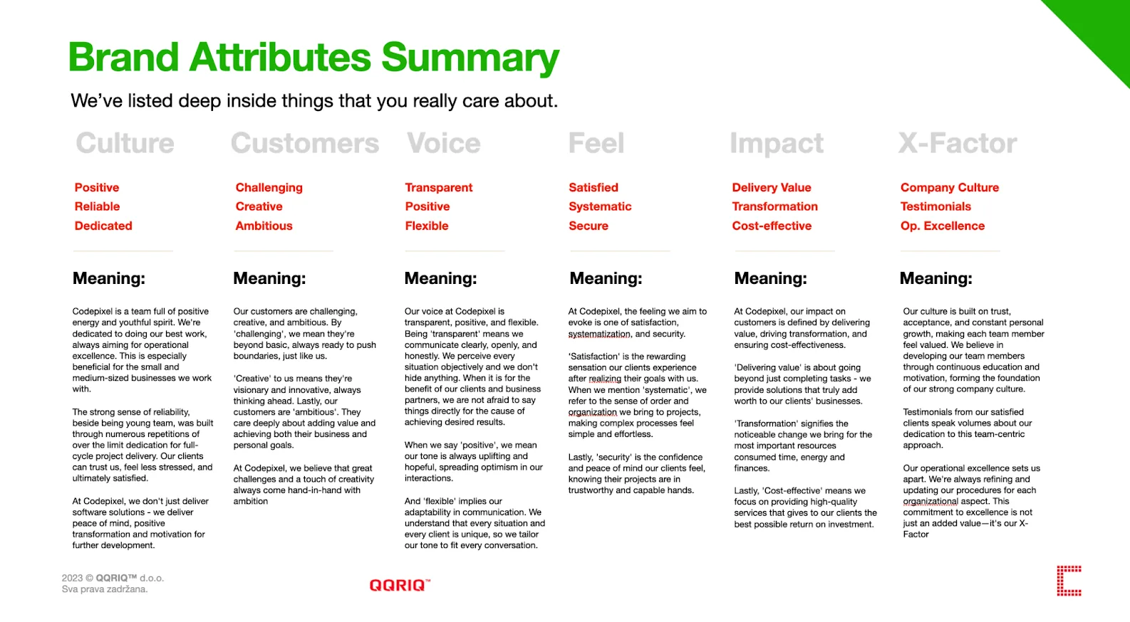
Decisions were made by the team. No single person got to pick, and the voting system was built to put multiple options on the table in the first rounds. After voting we were left with three attributes, single-word adjectives, for each column.
Then came the homework: building meaning behind the adjectives the team had chosen. That gave us the foundation of the whole process and the pillars of the Codepixel brand culture.
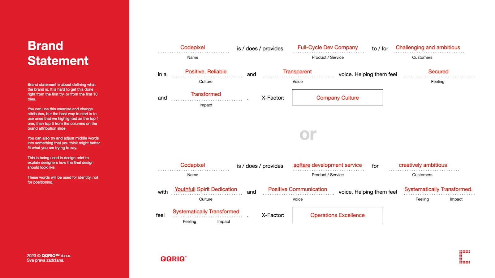
We also produced the first brand statements for the team to develop further.
The next workshops covered user profiles and business goals. For a design consultant this is where the business becomes legible: the services, the activities inside those services, the value they create for customers and the pain points they solve.
After a hard session defining customers, we moved to goals, plotting revenue, awareness and efficiency against desirability and doability. An effort and impact graph, in other words.
Stylescapes
At the final workshop we finally started designing. Stylescapes first. We split into small groups and built them out. These sessions were creative and genuinely fun, and a lot of design principles, aesthetics and styles got learned along the way. Four different style directions is what defines the aesthetic for the logo and the whole visual identity.
Four boards, 200 by 30 cm, were printed and presented so we could discuss them in the room, point at specific elements and say what we liked and what we wanted to avoid.
The stylescapes set the visual direction for the brand, guided the logo design, set the tone for the brand book and tied back to the user personas we had defined.
Society Improver

Milestone Seeker



Tech Capitalist

Our designers were walked through the whole process and picked up a lot about typography, messaging, design styles, imagery and design systems. Put simply: the connection between graphic elements and the meaning behind them, which is what sets the visual and verbal tone.
From a square to a circle
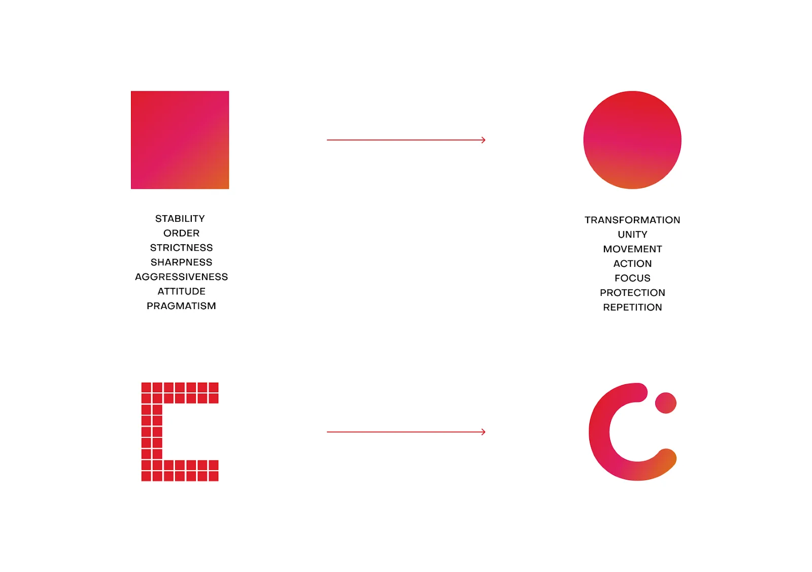
The first thing anyone thinks of when they hear "pixel" is a square. Anyone with a passing interest in the digital world knows what a pixel is and what it looks like.
That is where it got interesting. Dig into the DNA of Codepixel and the organisation is anything but basic, anything but surface, anything but a square.
We were after visual transformation, and we started thinking about transformation as an idea. Our work has a real effect on our clients' businesses, and we wanted to express that visually as well as verbally.
"What if our pixel is round?" someone asked.
That was the moment. We started thinking about the square as a fast-rotating element, which to the eye reads as a circle.
So we made a bold call: a circle as a pixel, representing an organisation that keeps moving and keeps developing, treated as a dynamic process rather than a fixed shape.
The decision was symbolic as much as aesthetic. It marked the shift from what Codepixel was at the start towards what it is now and where we want to be.
A splash of colour
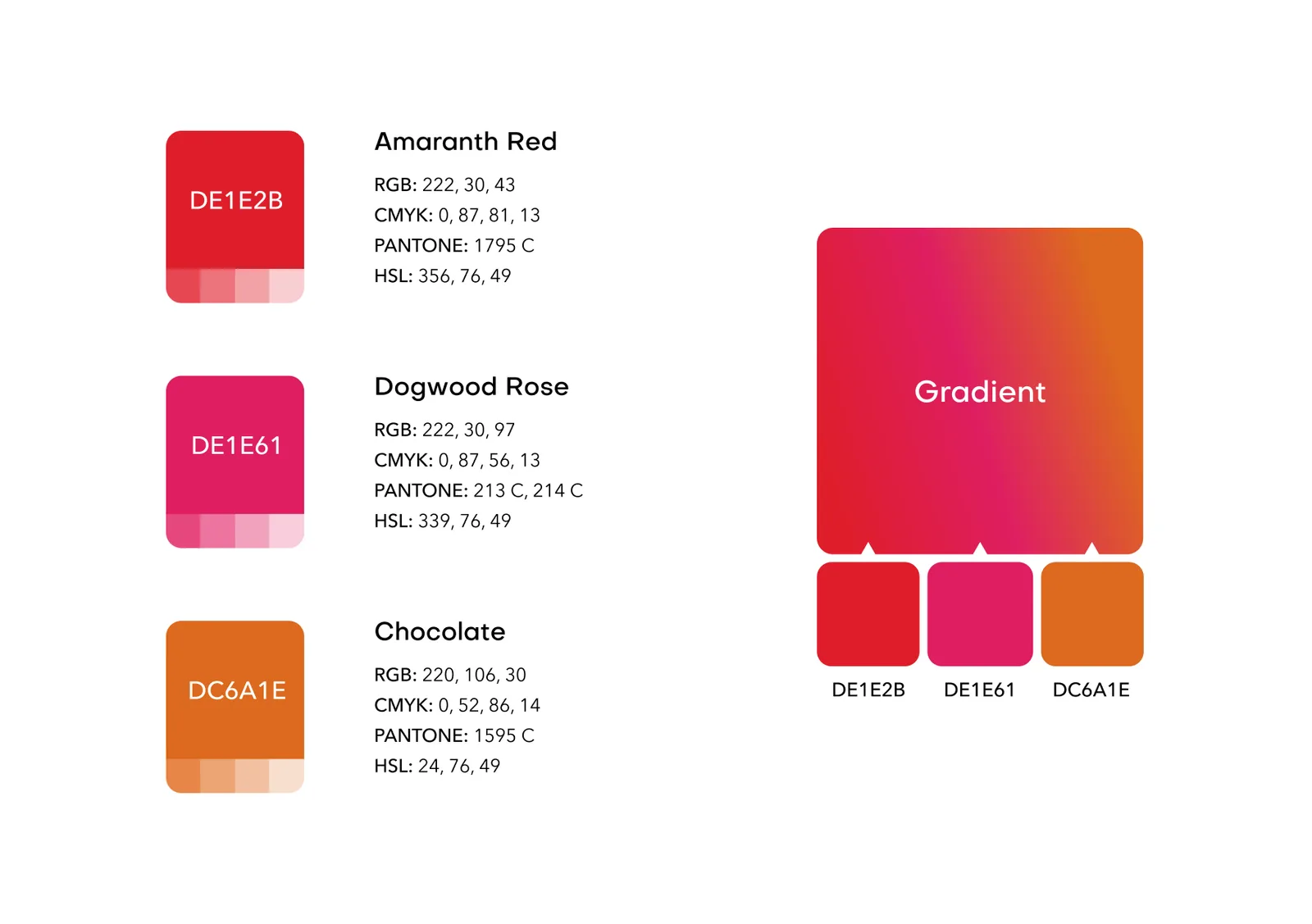
After a lot of back and forth, we widened the spectrum.
Moving from the classic black, red and white to a gradient palette was a strategic call. The three-colour gradient is now a cornerstone of the identity and carries the personality of the brand.
Patterns
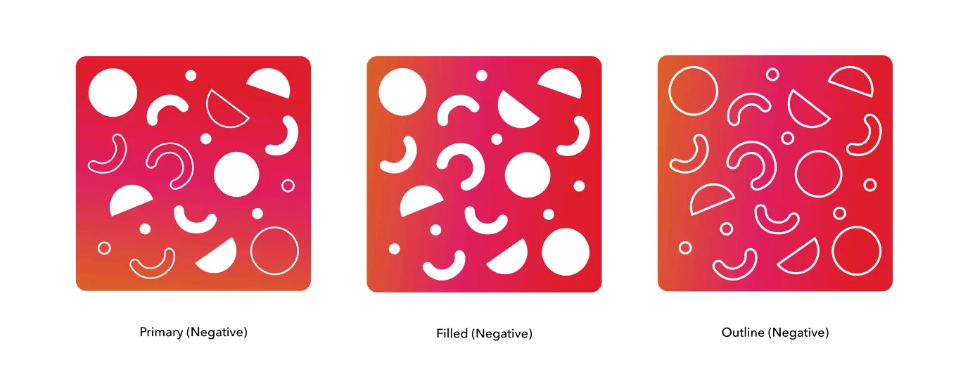
Leaving black, red and white behind was about breaking out of the monotony and getting to something more contemporary. The classic colours served us well, but we needed energy in the brand that matched how we actually work.
Pictograms
The letter "C" is the cornerstone of the identity. It takes on another dimension as a pictogram: the dot sits inside the letter and forms a human eye. That was deliberate, and it points at perspective, insight and clarity.
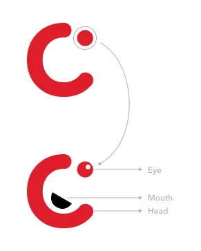
The pictograms carry a range of emotions, so the brand can communicate feeling as well as ideas. Designers are encouraged to make new ones, as long as they keep the red and the black mouth.
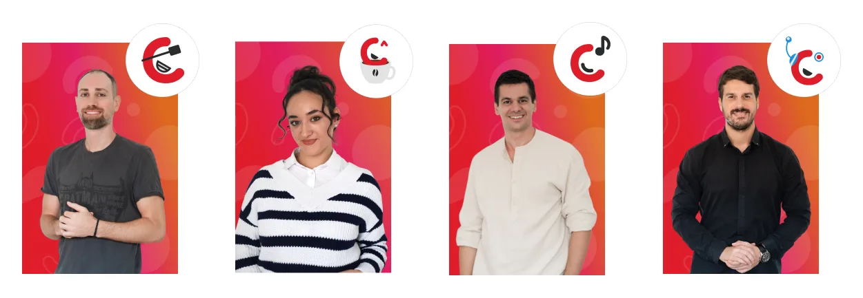
C as in Codepixel
The logo went through many iterations. The final mark blends abstract and literal elements and reflects both the new approach and the expertise behind it. It is versatile, scalable and recognisable across mediums, and aligned with the stylescape elements we chose.
The result is a logo in vibrant gradient colours that reads as a company with a positive culture. We think it represents us the way it should: a good place to work, a valuable partner and a contributor to the community.
Next up is the website. The current one, lightly updated with the new styleguide, is a transition into the new brand.
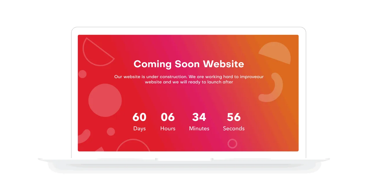
The new site will be the face of the company, built on modern tooling, giving visitors an experience that matches the spirit and culture of Codepixel.
Our thanks to the European Bank for Reconstruction and Development for supporting the rebrand through the Youth in Business programme. Their grant helped us redefine the visual identity and backed our commitment to innovation, youth and digital work.
There is also a short film about the process: Codepixel Transforms Its Visual Identity.
Was this useful?