Mobile App Development, Web DevelopmentMontenegro
They handled issues and feedback with professionalism and expertise.
5.0
Built with UNDP, it maps Montenegro's gender statistics across employment, education and political participation on an interactive, region-filterable map, designed and shipped in under two months against a fixed launch date.
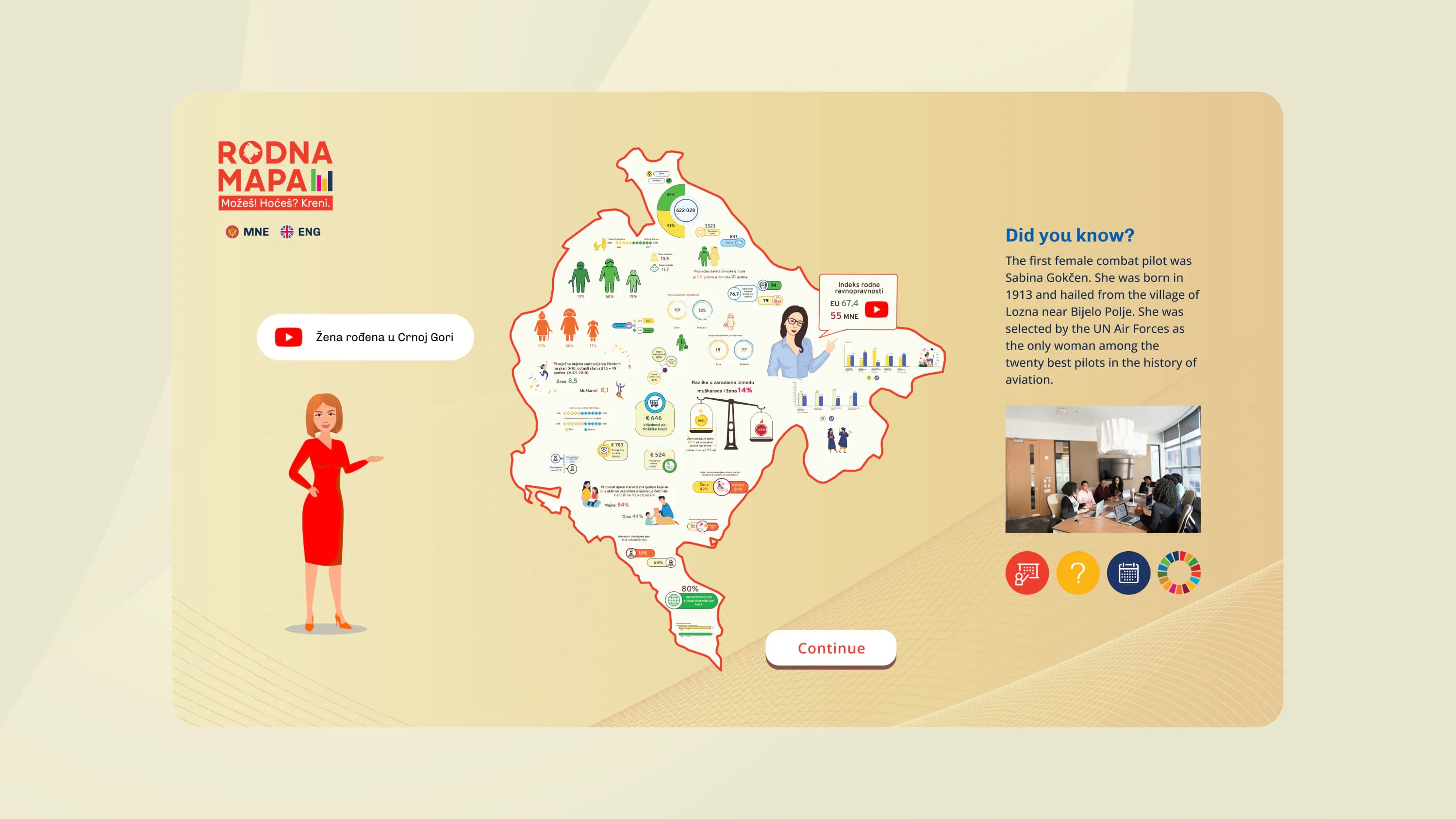
Gender Map (Rodna mapa) is a Montenegrin public platform that maps gender statistics across key areas of society, employment, education, political participation and more. It gives citizens, journalists, researchers and policymakers a single place to explore and compare gender data across Montenegro's regions.
We designed and built the full product: UX/UI design, a custom Angular-based interactive map, purpose-built data infographics, a backend API and cloud hosting. The engagement ran from October to December 2020 under a fixed-scope contract, in partnership with UNDP.
The platform had to present complex, multi-dimensional statistics to a general-public audience, most of whom have no data background. Off-the-shelf chart libraries could not support the navigation model the client had in mind: a map-first, region-filterable interface with category-specific infographic treatments. And the launch date was fixed. Every decision, scope, architecture, design process, QA, was made against that deadline.
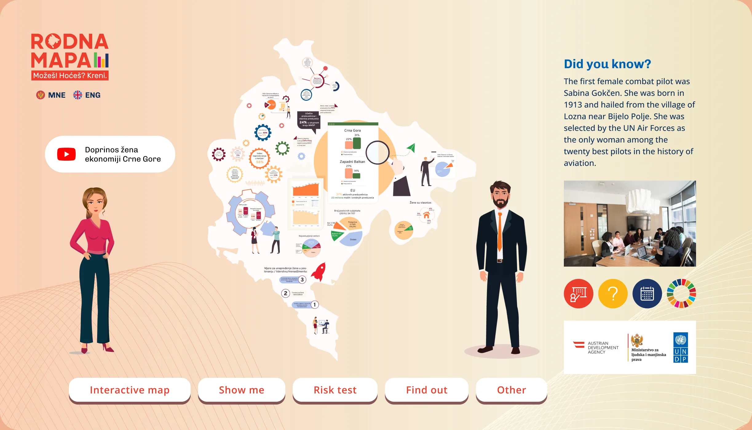
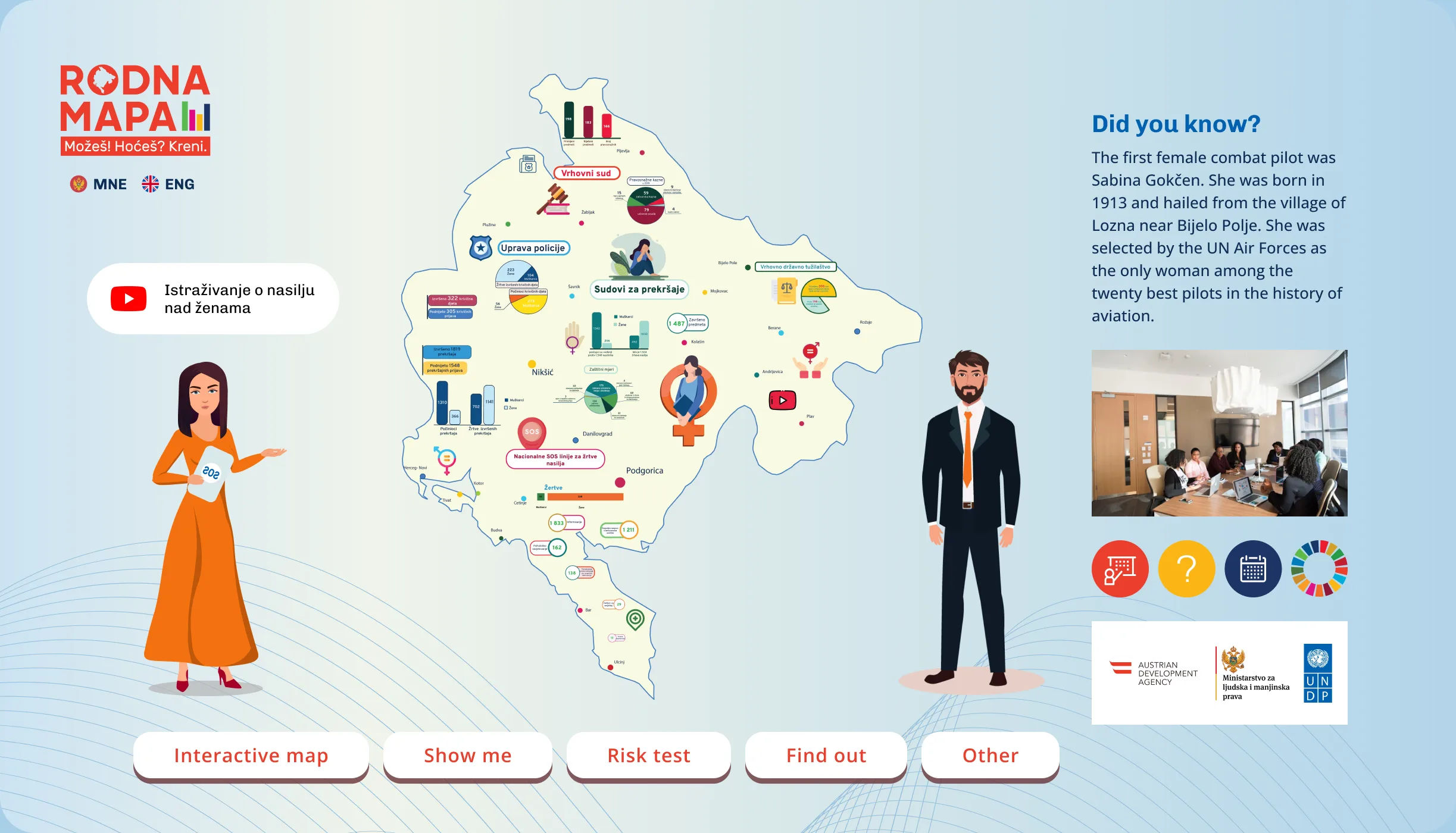
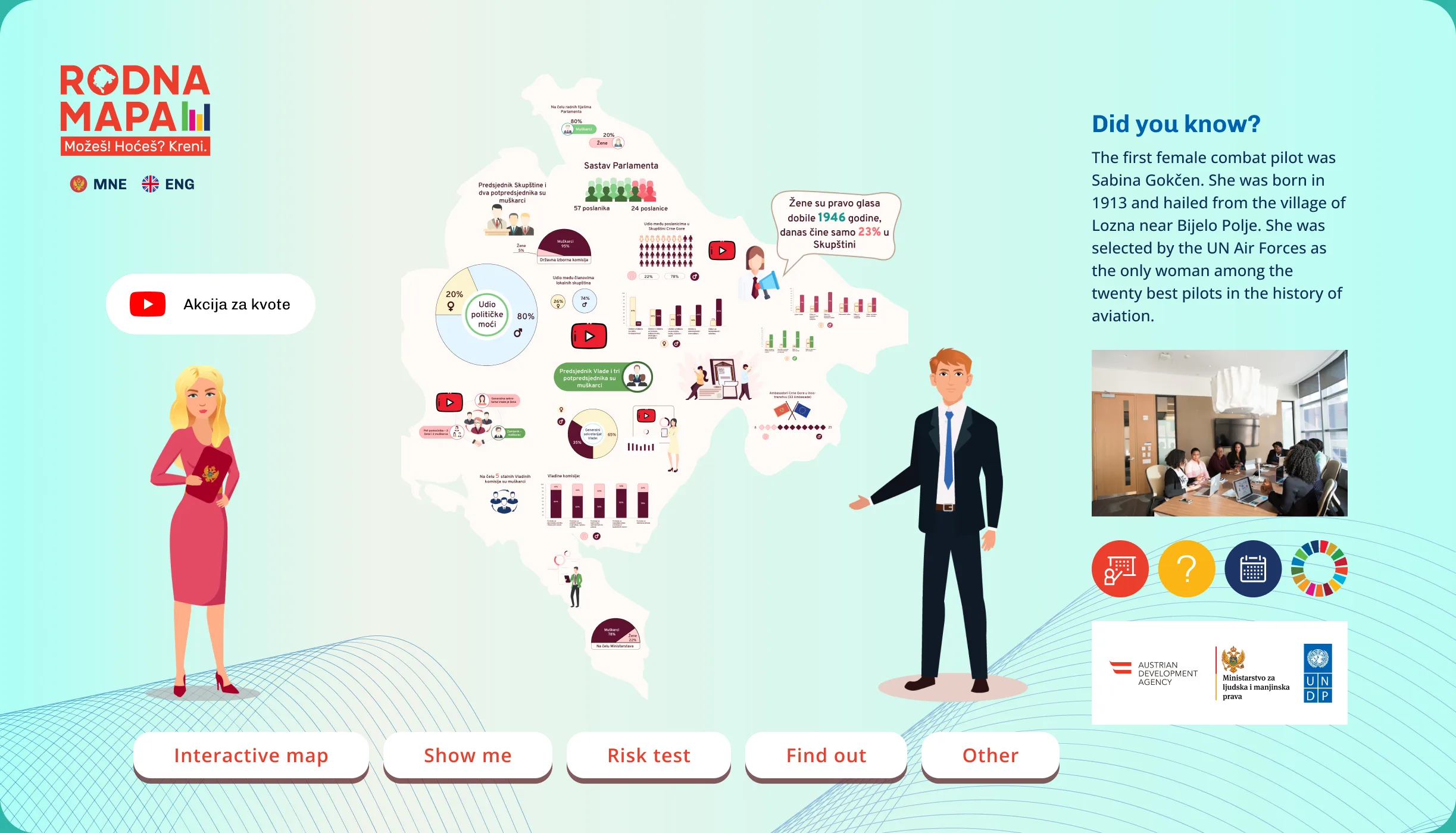
A map you click, not a spreadsheet you decode.
The platform is built around a clickable, filterable map of Montenegro. A user selects a region and drills into gender indicators by category, and each data point links to a detail view with source citations and regional comparisons. We built the map in Angular without an off-the-shelf mapping library, because none matched the navigation model and data structure the client needed.
Statistics a non-specialist can read fast.
Each category has its own infographic treatment, proportional figures, comparison graphics and purpose-designed charts instead of standard bar and pie charts, so a statistical difference is visible without a data background. The UX/UI designer worked alongside the frontend team throughout, keeping design and build in sync rather than handing off a finished spec.
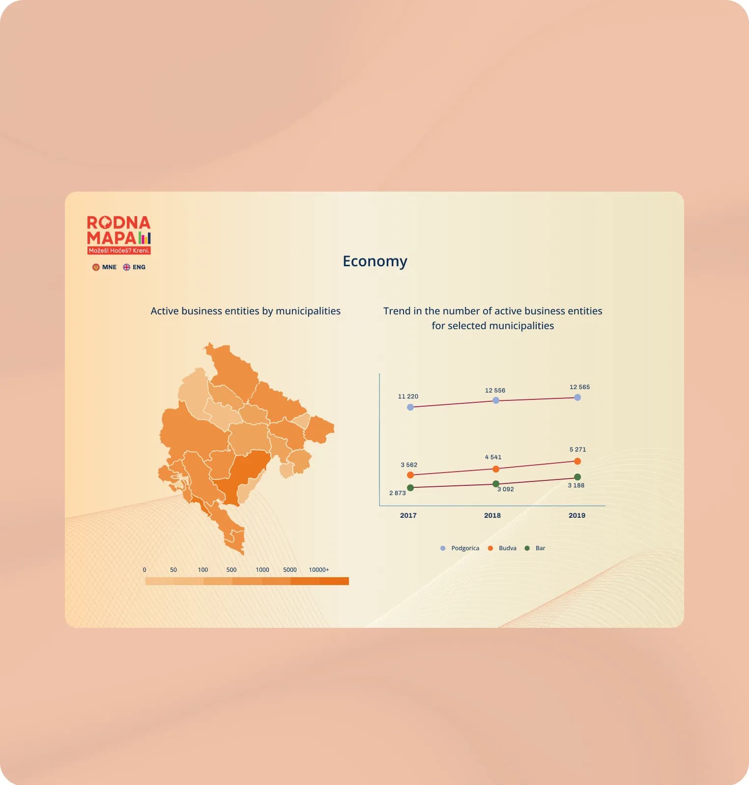
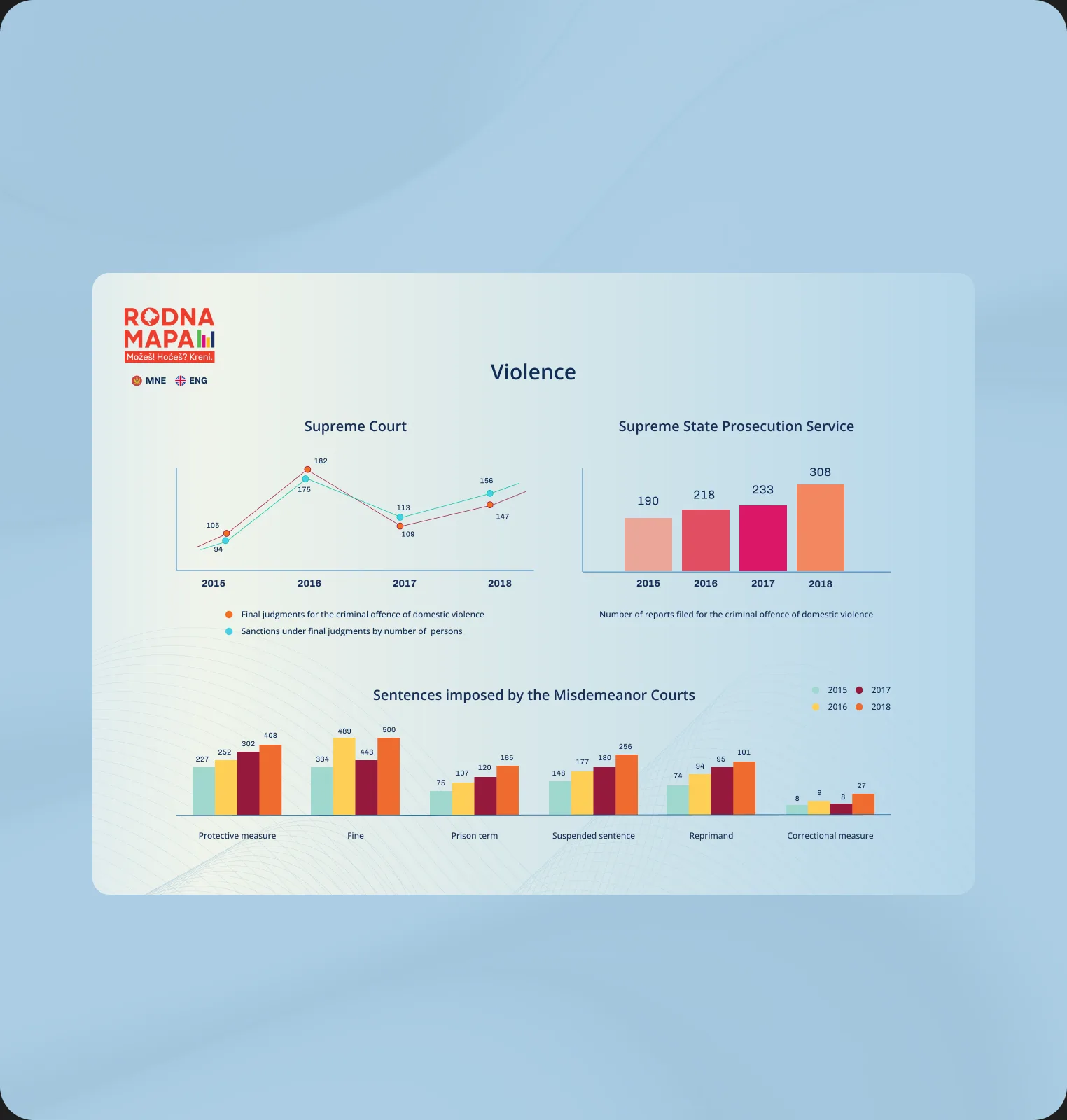
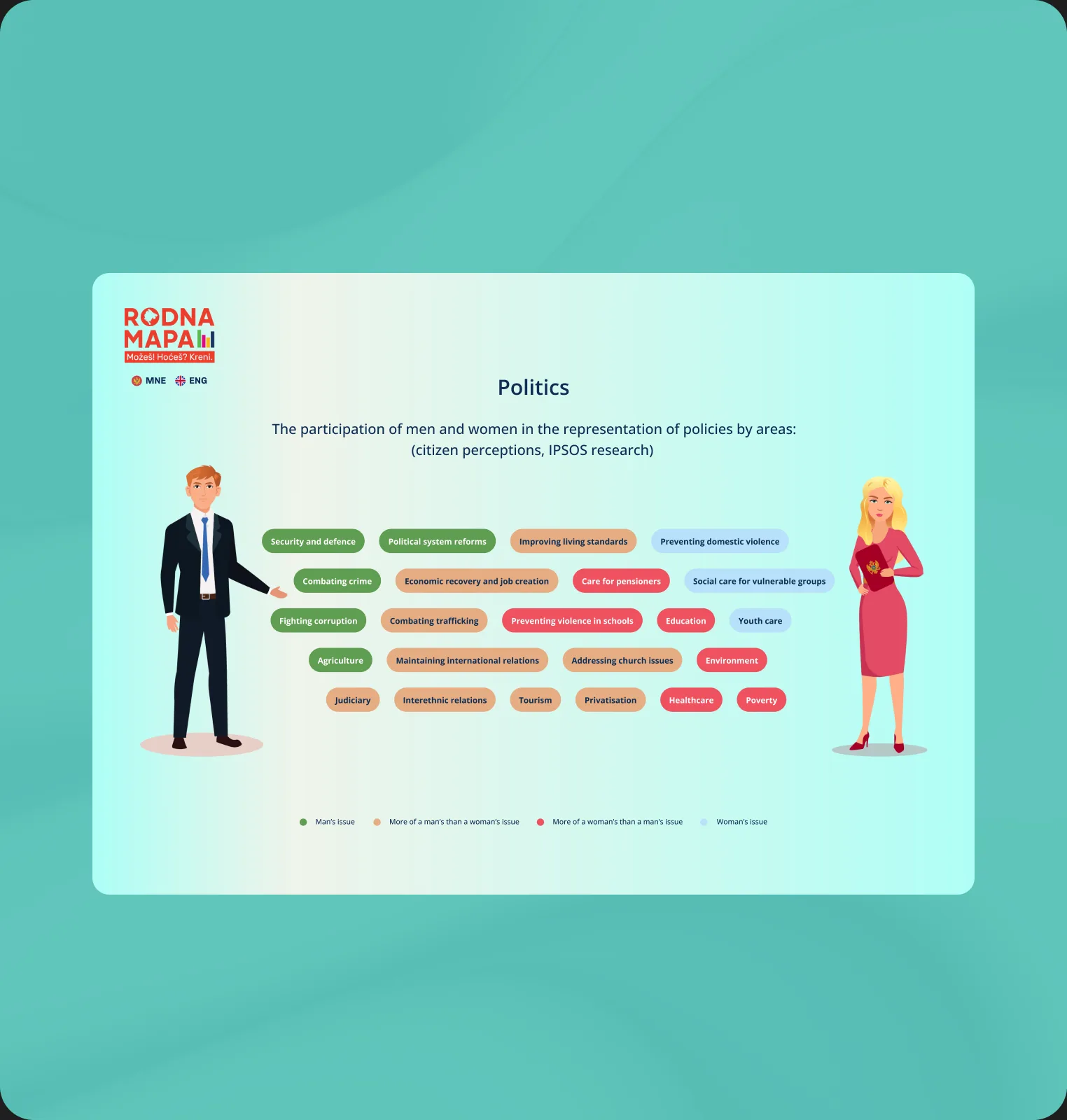
Complex gender data, made readable by anyone, not just analysts.
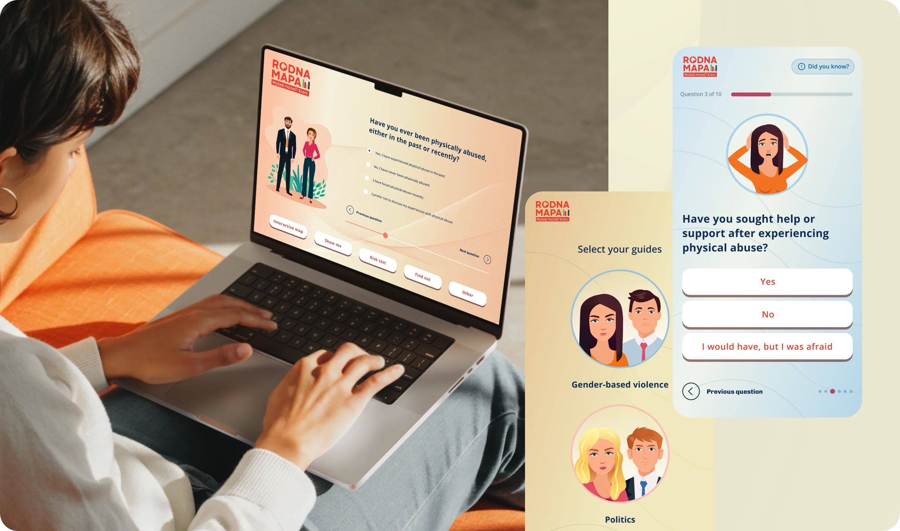
Dozens of indicators, and you always know where you are.
With data spread across many spheres and dozens of indicators, the risk was users getting lost. We structured the platform around top-level category pages with a consistent layout, so a visitor always knows where they are and what to explore next. The IA was agreed in the first two weeks, locking the page structure before development and keeping scope stable against the deadline.
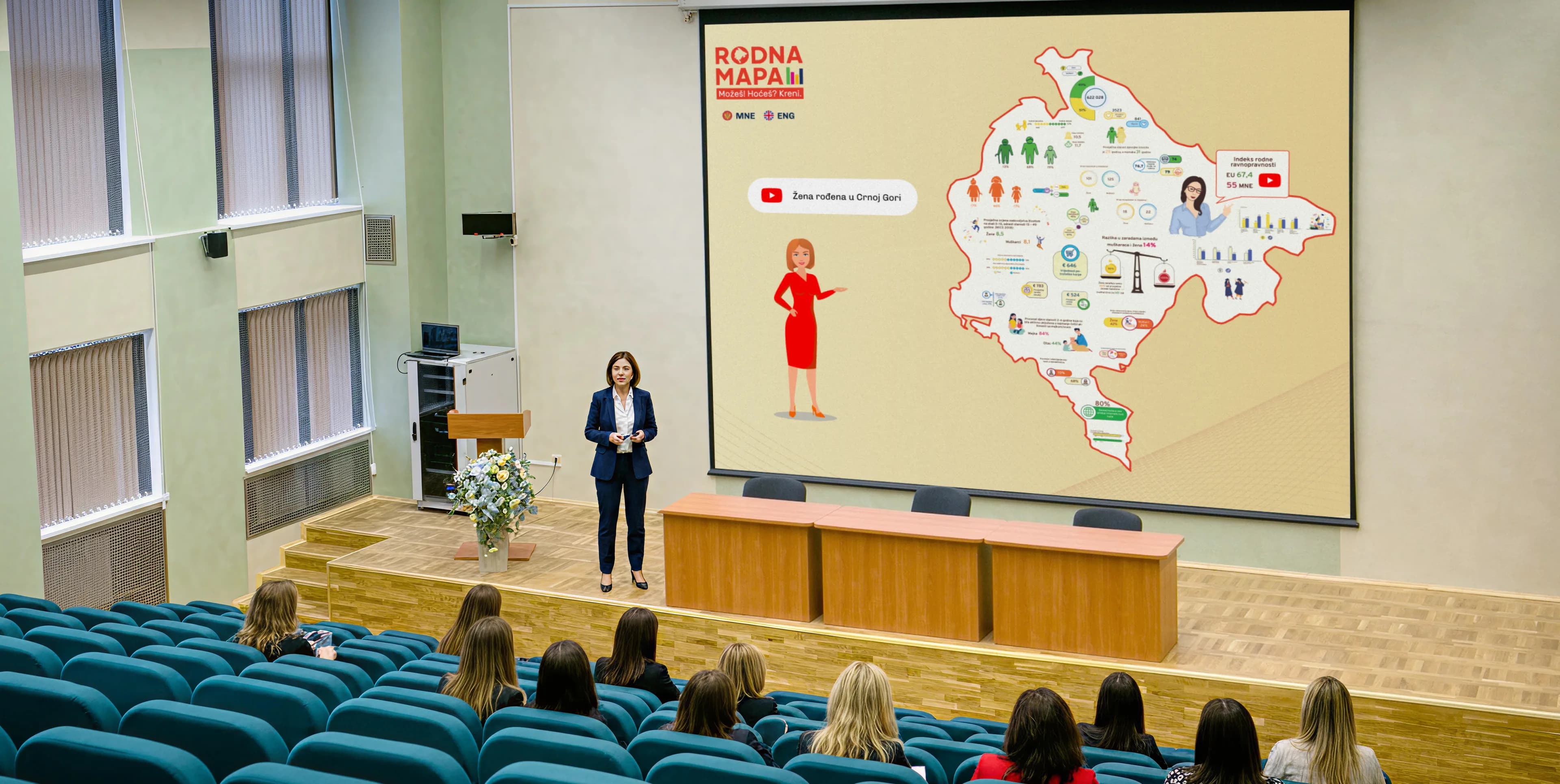

A solution made possible through the collaboration of three donor organisations.
A fixed public launch date, hit without trimming the scope.
Whether you're starting an MVP, stabilising a growing product or planning AI features, we'll help you choose the smallest sensible starting point and a delivery model that fits your team.
Our playbook for integrating AI into product design and development workflows.
Download the playbook