Web DesignGermany
They are flexible when it comes to designs and functionalities.
5.0
A full redesign of GIZ's Afghan-German cooperation presence: new information architecture and sitemap, research-led UX, four languages across two writing directions, and a flexible block-based admin the team runs without a developer.
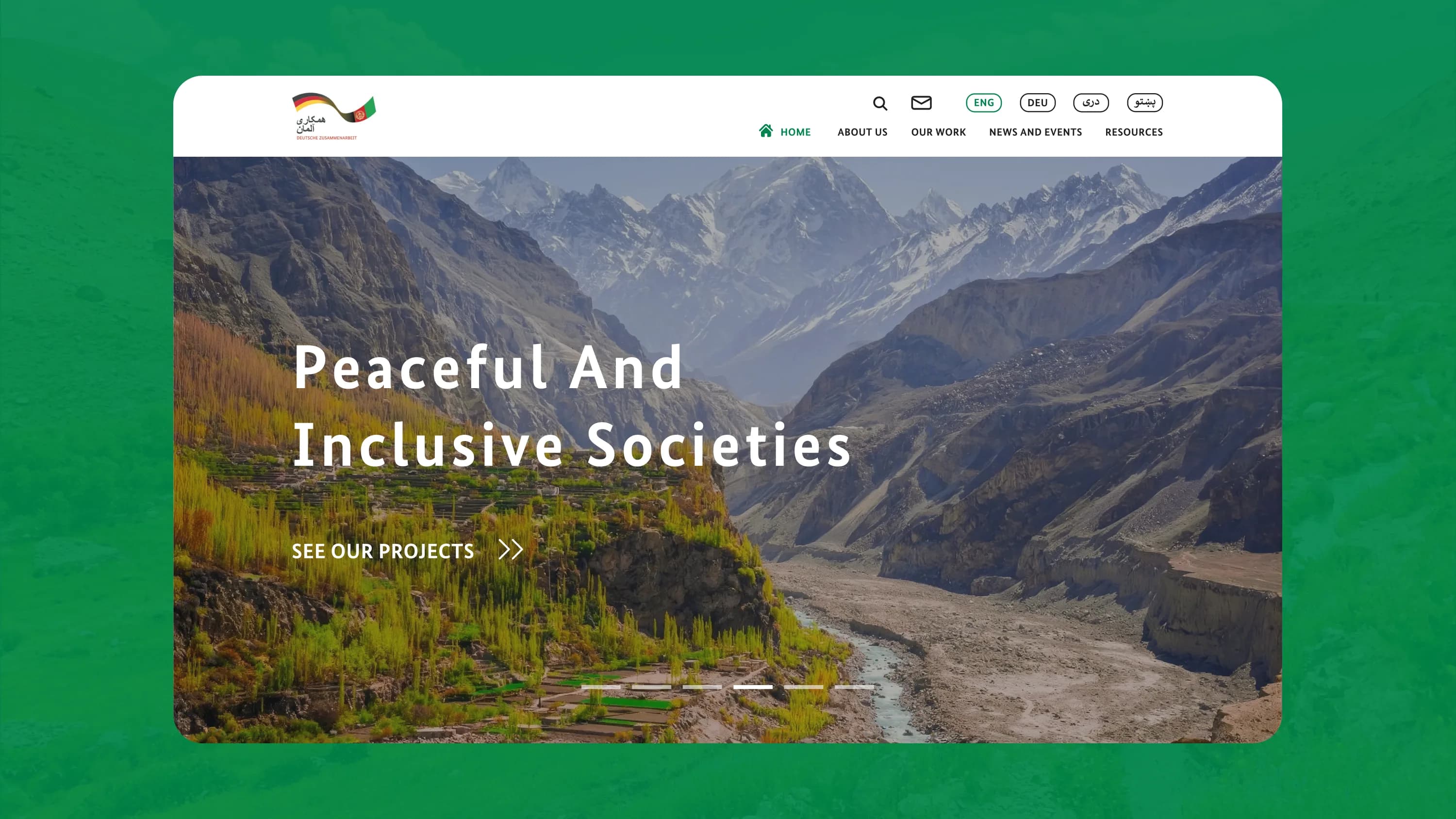
GIZ (Deutsche Gesellschaft für Internationale Zusammenarbeit) is one of the world's largest economic development agencies, with offices in more than 120 countries. It works on behalf of the German government to support economic cooperation and development.
Codepixel partnered with GIZ's headquarters in Bonn to refresh the entire online presence of the organisation's Afghan-German cooperation, which had become outdated. We ran the user research and usability analysis, redesigned the information architecture and the sitemap, prototyped and designed the new experience across four languages including right-to-left Pashto and Dari, and built it as a custom WordPress site with an administration layer the team can run themselves.
GIZ's Afghan-German cooperation site had gone out of date, and it carried an enormous amount of content: years of projects, news, events and resources spread across a very large number of pages. Size was the real problem. Visitors could not reliably find what they needed, and the team could not keep the site current without help.
GIZ needed the whole thing rethought rather than restyled: a content architecture that makes a large archive navigable, a design that matches the standing of a global development agency and an admin flexible enough to grow with the cooperation work it documents.
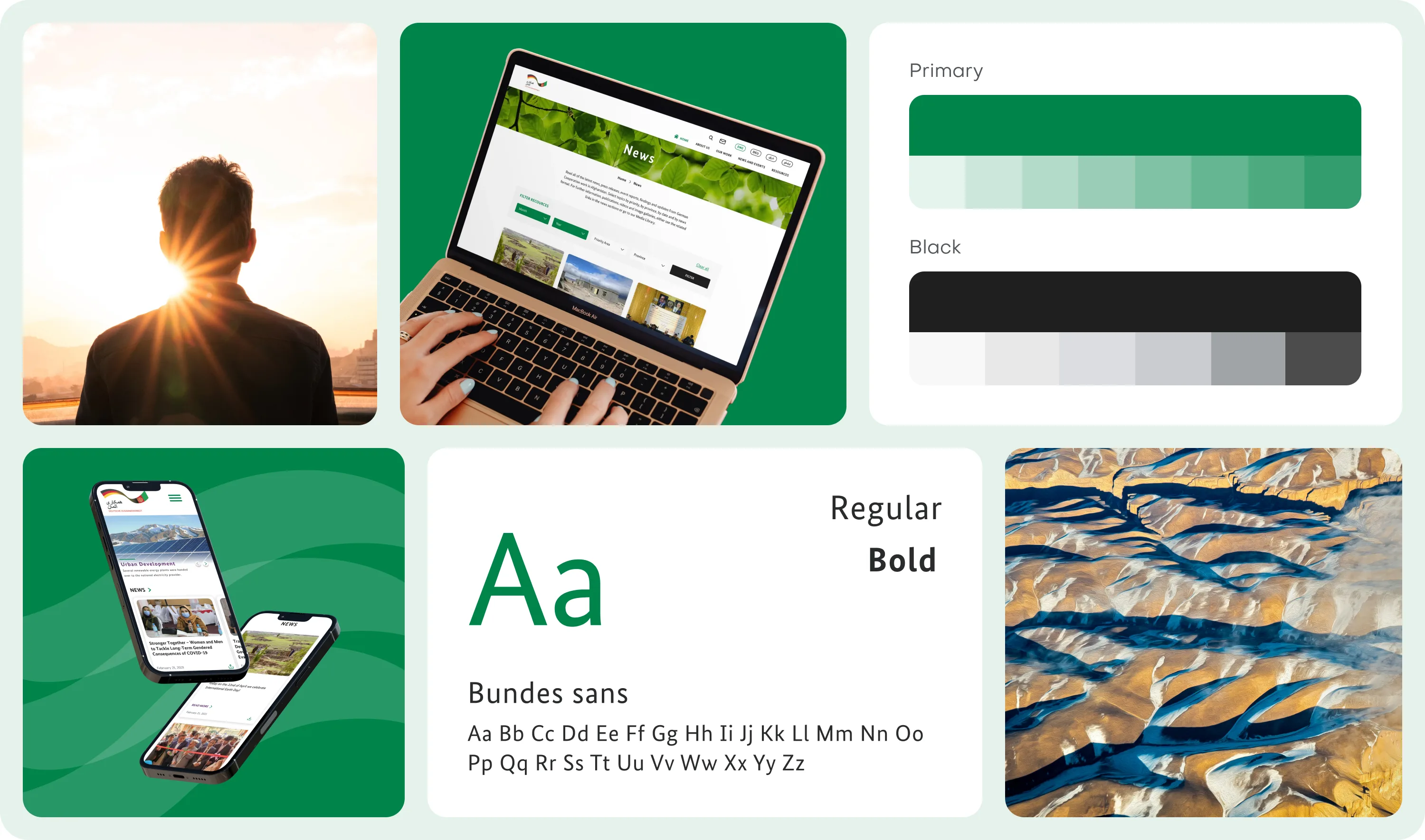
A design system that holds together across every kind of page.
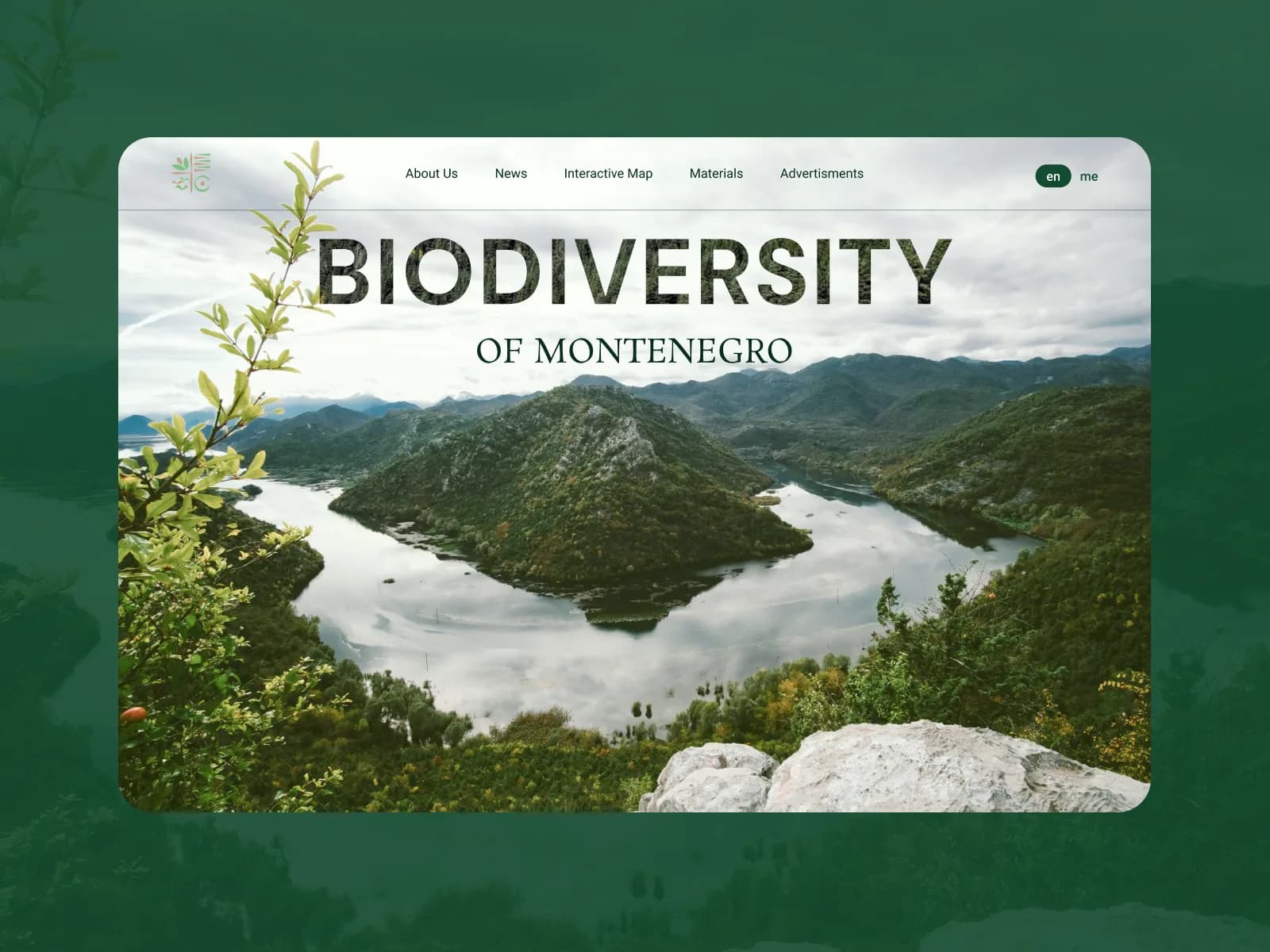
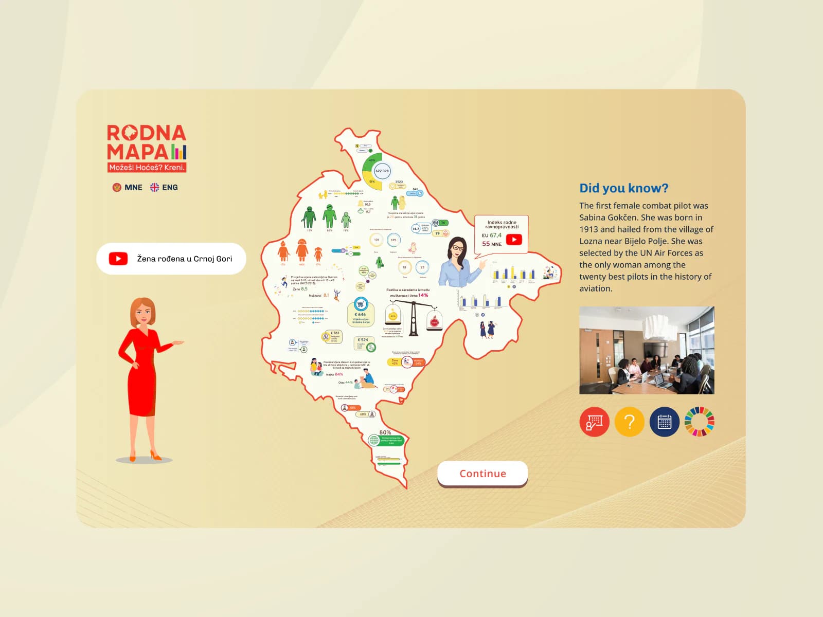
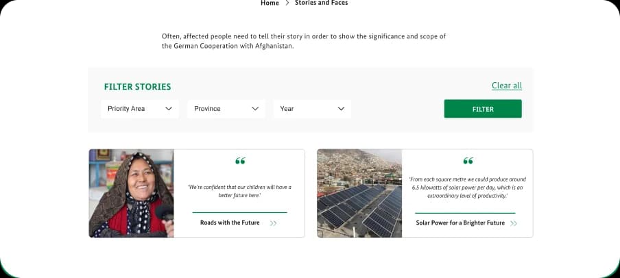
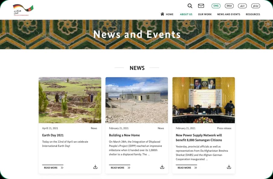
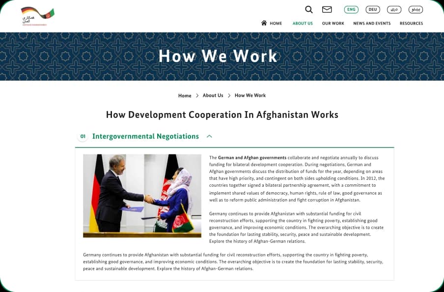
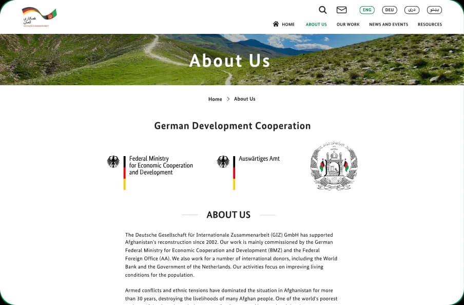
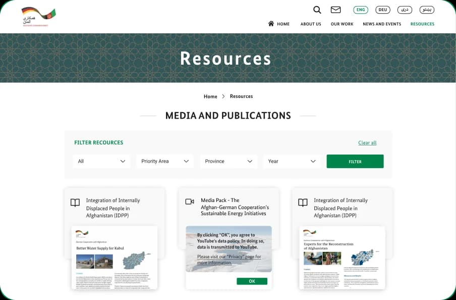
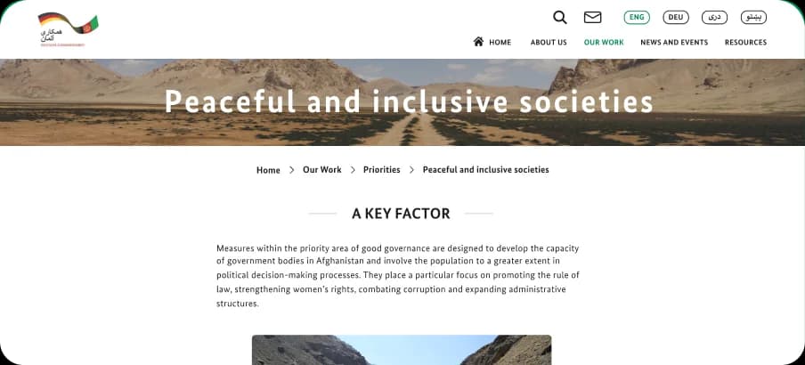
The interface gives GIZ's work the visual standing it should carry: strong regional photography, a clear typographic hierarchy and a consistent component set reused across every template. Dense institutional content becomes something a reader can move through, and the same system holds whether a page is a project story, a news item, an event or a resource library. Consistency across templates is what stops a site of this size from feeling like several different sites.
A very large archive, made navigable.
The old site had grown to an enormous number of pages, and its structure no longer matched how people actually looked for things. We rebuilt the information architecture and the sitemap from the ground up, grouping the agency's work, news, events and resources so a visitor can move from a broad interest to a specific project without guessing. Structure was the first design decision, and the one everything else depended on.
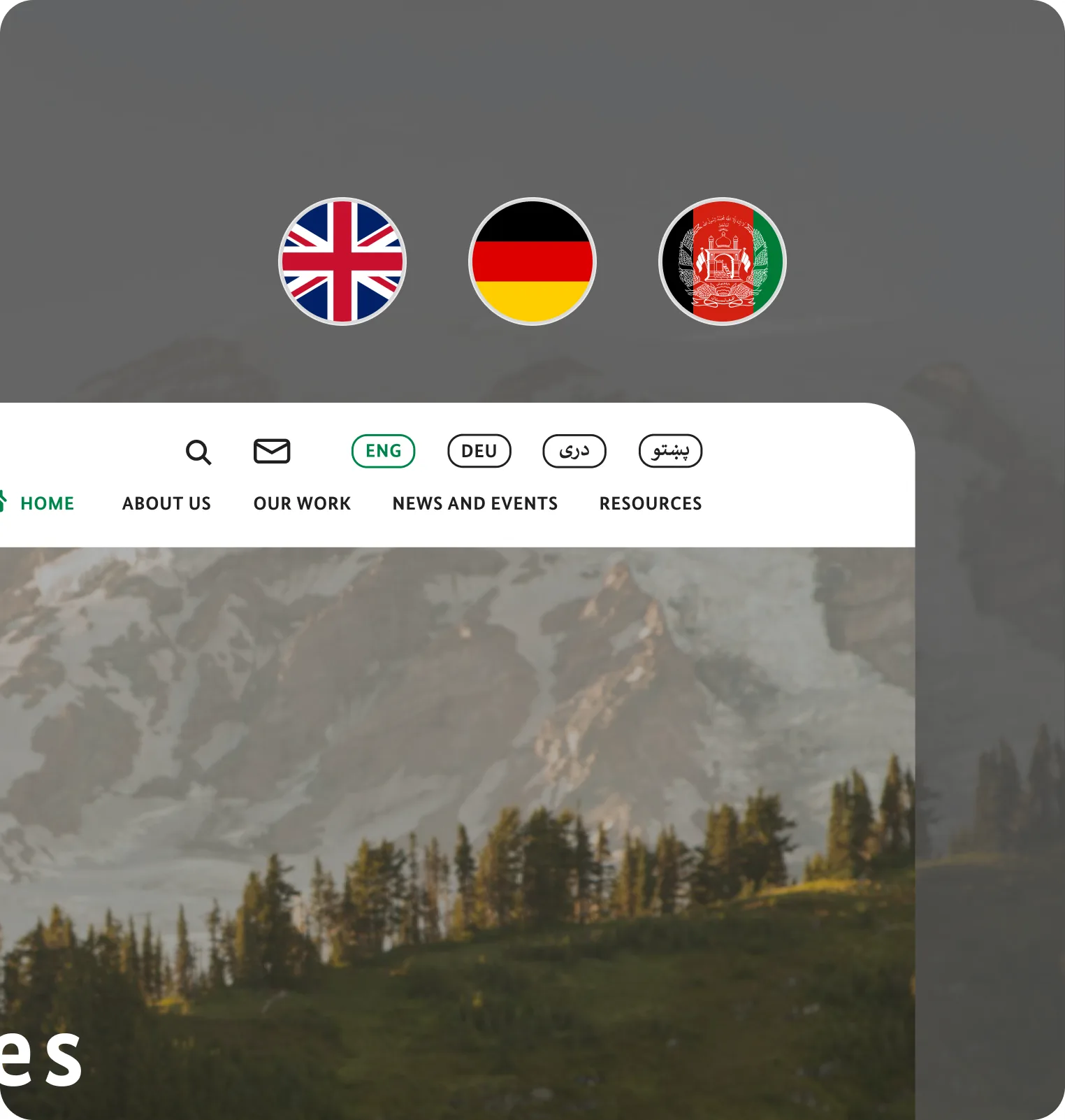
Four languages. Two writing directions. One design system.
The site runs in English, German, Pashto and Dari. The first two read left to right. Pashto and Dari are written in the Perso-Arabic script and read right to left, so those versions mirror the layout rather than translate it: navigation, page structure, component alignment, directional icons and the order a reader's eye travels all flip.
The script behaves differently from a Latin alphabet too. Letters join and change shape depending on where they sit in a word, and the type needs more vertical room to stay legible. Every template was designed to carry all four languages properly, without a separate build for any of them.
The structure was the design problem. Everything else followed from solving it.

The team builds pages, not tickets.
The administration layer was built for flexibility. GIZ's team assembles and updates pages from configurable blocks, so new content and whole new sections go live without a developer in the loop. That capacity is what lets the site keep pace with the cooperation work it documents, instead of drifting out of date again.
Whether the problem is an archive nobody can navigate, a design that no longer matches your standing or content that has to work in more than one language and more than one writing direction, we'll help you pick the smallest sensible starting point and a delivery model that fits your team.
Our playbook for integrating AI into product design and development workflows.
Download the playbook